ART AND ME

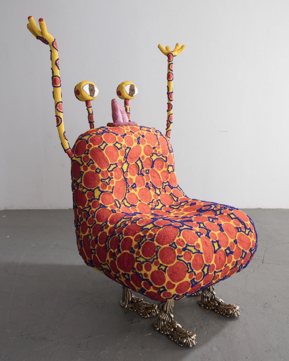
My personal connection to art has boomed in such a rapid and enormous way, not so much as the industrial revolution but you get the point.

At times I feel like I cant catch up with myself. Throughout my journey in art, and as it continues I have had self realizations. This time last year I had no idea what I wanted to do in life. Right now, I still don’t but I might have an idea. As I am in school taking random classes that pretty much just fill up space. I have also applied myself to a certain degree. No longer do I was as much time with my eyes glued to my phone or TV screen but more on the pencil in my hand and work of art laying in-front of me.

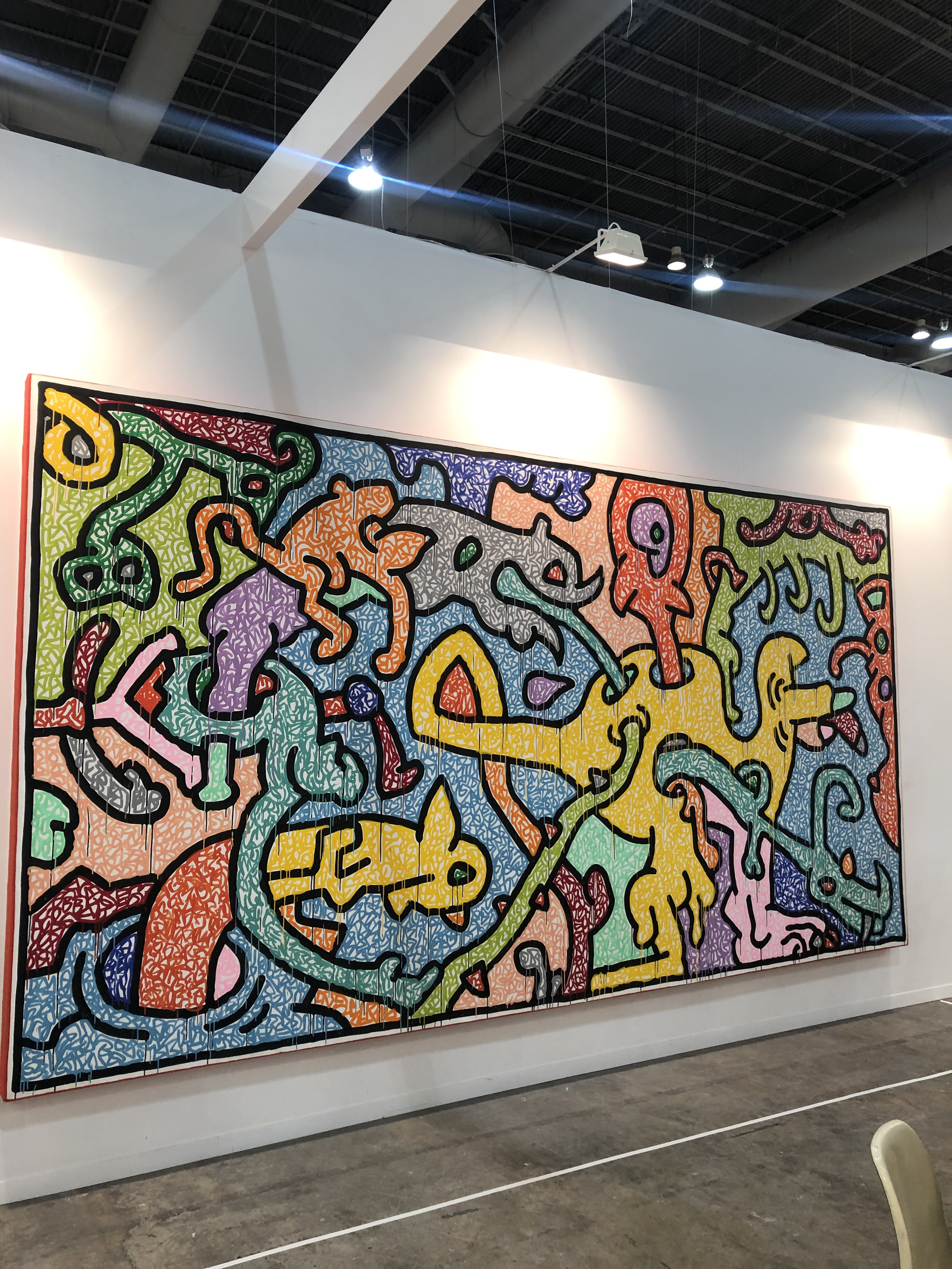
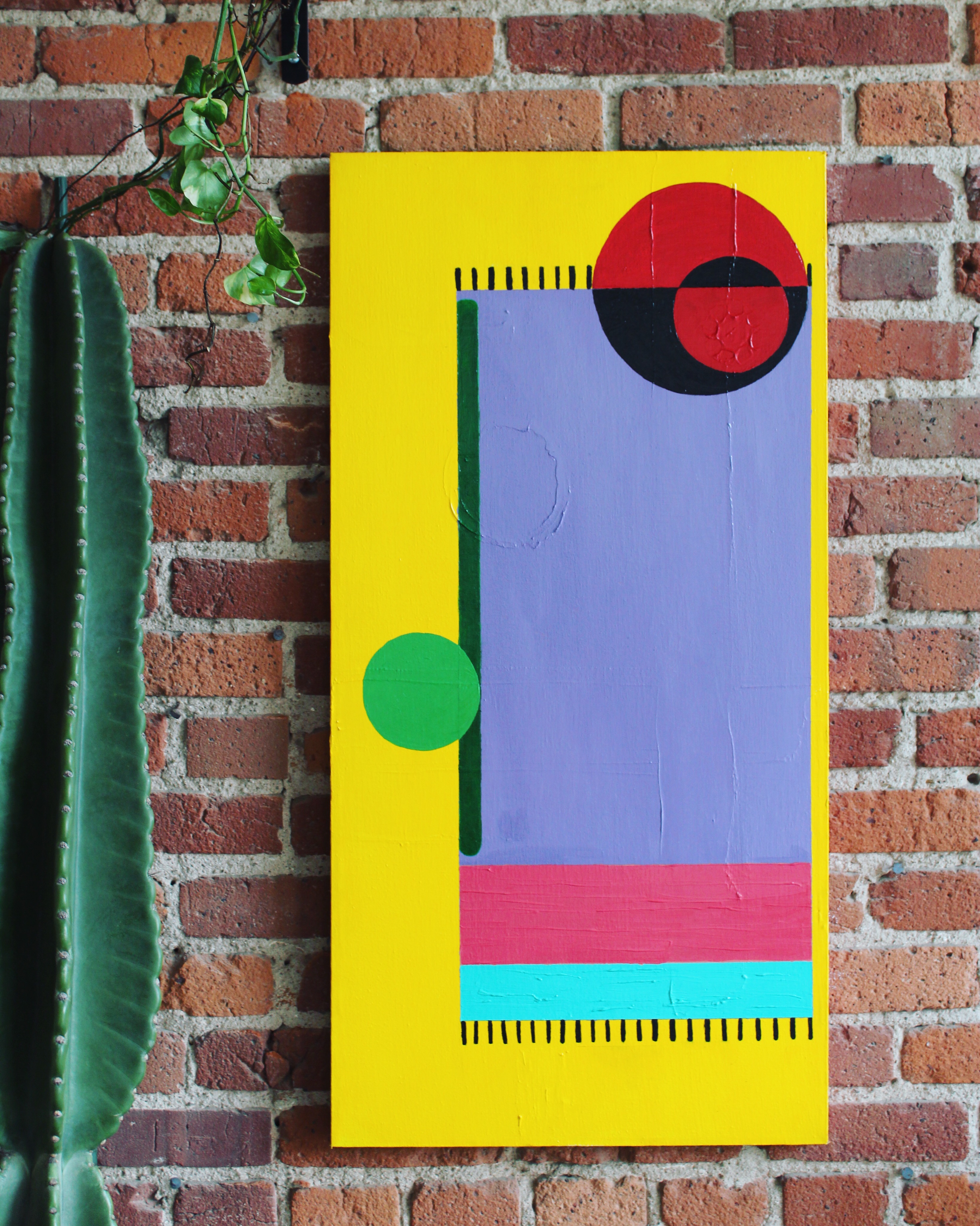
As there is much more knowledge to obtain I do think I admire creative work as a full arrangement. Currently looking at other schools that priorities on art is very difficult and of course stressful. Finding the courage to take the next step in life is even more daring. As of right now I would like to major in creative writing since it doesn’t completely kill me and minor in studio. Creative writing is very much a form or art. As you have read in my past post everything and anything can and is an art. I believe words and language in comparison to linguistics is so interesting. I want to share what I have and know with my words. That’s the dream right?

Taken at the art festival-First Friday’s including myself along with my art of Erik Wolf’s.

Finding a combination between art and writing but also incorporating it into the real world and becoming successful is what I am striving for. I know for a fact that it isn’t impossible, at times very difficult but yet achievable. I’m not one to boast but overall I am proud of myself.

Taken at the Jones Art Gallery for an art exhibition featuring my painting.

ART NOT FURNITURE

Not even a year ago I moved out of my parents house. Now I live in the city, but when I first moved in I really didn’t have any furniture. I didn’t realize how much time and effort I would be putting into furniture shopping until now. As I still continue shopping, I look for the details art with every piece.

The Sofa- Floyd

“The intent of art is different from that of [furniture], which must be functional,” Judd wrote in his 1993 essay “It’s Hard to Find a Good Lamp.”

Artists making furniture is an old debate over whether design counts. Furniture designers weren’t considered artists until now. Thanks to a creative block, a desire to make money, artists descend from normal definitions of art. That few artists or designers today would accept the terms of this debate is in part because of the 1970s and ’80s rise of postmodernism in both art and design. Postmodernists have made clear distinctions between both, and the idea that an artist’s work could also include chairs and tables became commonplace.

A Chair for Twins to Intertwine- Faye Toogood

The image above, that I admire, I find amazing and extremely relative to representing furniture in another perspective as modern art. London-based designer Faye Toogood was pregnant with her twin daughters last year, she found herself dwelling on the image of a double-yolked egg, which conveyed the squishy comfort of snuggling in a warm space. Furniture in fact is very artistic.

These generic boundaries have been collapsing for decades. We now seem to have reached the inevitable conclusion that form and function are increasingly indistinguishable. More and more artists produce functional commercial objects and more and more designers are creating furniture. Everyone now is an artist, and anything is possible.

The Haas Brothers, Spotley Cru, 2017. Designed and made by The Haas Brothers and The Haas Sisters. © 

BOOKS FOR THOUGHT

I can probably assume, unless you deem yourself artistic in some form, have not put much thought into the book cover of a novel you might be reading or have read. Well I in fact have, I think that the expressionism on the book is just as important or more so to whats within. Let me explain why.

People automatically judge a book by its cover. Think about it, when you pick up a book and glance at it the first stimulation you are interpreting is the cover, how it looks, what colors it uses, if it is a certain style. Due to this effect, that’s why it’s that much more important. I myself used to hate reading and when I did I chose the book with the cover that stood out to me the most. I didn’t even read the summary of what they were about. Now, of course, I analyzing every single aspect from front to back and ensure I’m purchasing the best read. The thought that goes into the creation of a book cover blows my mind when I think about it. How deliberate the collaboration between writer and artist must be so the author can be seen through the cover. In many occasions though there is no contact but in my opinion there obviously should be.

Okay now here’s a different connective to the notion that book covers are highly important. The cover serves a purpose to show a preview for the writing. The cover provides a visual description to who the author is, a little bit of themselves. There is a specific book that talks about just this. Short novel, I finished it quickly over the course of a two hour plane ride. “The Clothing of Books” by Jhumpa Lahiri. She explores the art of the book jacket from the perspectives of both reader and writer. Probing the complex relationships between text and image, author and designer, and art and commerce, Lahiri delves into the role of the uniform; explains what book jackets and design have come to mean to her. This deep reflection novel is one of many examples to why the design aspect of publishing is so significant.

“The Clothing of Books”- Jhumpa Lahiri

PEACE MAKER

I am absolutely fascinated with graffiti and have such an admiration for it as whole, from talent and thought put into the art to the meaning behind beautiful murals we oh so admire.

“Flower Thrower” -Banksy

Some of the earliest expressions of street art were certainly the graffiti which started showing up on the sides of train cars and walls. This was the work of gangs in the 1920s and 1930s New York. The impact of this subversive culture was extraordinarily felt in the 1970s and 1980s. It was a time when young people, by responding to their socio-political environment, started creating a movement and taking things into their own hands. Soon, this subcultural phenomenon gained the attention and respect in the grown up world. From the fingers and cans of teenagers, it had taken a form of true artistic expression.

Since creating graffiti is quite more difficult and inaccessible with paint cans, I along with a partner in crime of mine have been using graffiti pens. The urge to buy a couple paint cans and go all out on the city is so tempting but markers will have to do. One specific brand that is a fan favorite is called Krink. The pigmentation is out of the world.

Along with that, there is a specific technique that got me into ink pens in the first place. A sort of drip effect that has a similar look to actual graffiti. These markers are bulky and have a felt tip that absorbs ink, since the felt is so thick its perfect to create this look. The main thing I have a good time using these pens for is to tag. Tagging is some of the most common styles of graffiti have their own names. A tag is the most basic writing of an artist’s name; it is simply a hand style. A graffiti writer’stag is his or her personalized signature. Given a sense of individuality and activating ones creativity.

WATER COLOR GALORE

Recently I stumbled upon water colors. Personally, I am extremely inexperienced with how to use it and what strategy is supposed to be used but with the following tips a professional clean look can be achieved.

Watercolor is a painting compound using water-soluble pigments that are either transparent or opaque. Techniques like washes, working wet in wet and wet on dry, lifting out and masking out for highlights, and dozens of other techniques to achieve textural effects. But most of all, watercolor painting comes back to the premise that the watercolor lessons and methods matter but what matters most to a watercolor artist is letting go and finding a balance between controlling and freeing this painting medium. It is a painting compound using water soluble pigments that are either transparent or opaque. While watercolor is last on the list for durability and longevity, it is a medium that is very distinguished. Traditionally, watercolor artists work on paper. Oftentimes the white of the painting surface will gleam through and lend itself to the luminosity of the painting.

When it comes to colors there are many many different kinds to choose from and there are many beautiful pigments and paint formulations out there. What provides the color is the pigment. So the final color of the paint depends on the pigment concentration and the mix of pigments in each paint’s recipe. Also, single pigment paints produce more lively and vivid colors than several pigments mixed together. This is why, when you mix a lot of different watercolor paints together you tend to get a slightly dull result.

The picture featured above is my first attempt with water colors mixed with magazine cut outs. Since it was my first time with no experience I figured to try and give my painting a little quirky kick to it. The featured cut outs are meant to be symbolic and representative to women but specifically myself.

Regardless, don’t stress about any of this. You now know more about the objective measures and characteristics of watercolor paint. But choosing paint is always a matter of personal preference. Start with a basic but limited color palette and enjoy the process.

MEXICAN FINESSE

Last February I took a trip to Mexico City. During this trip I experienced how much history the land obtained. The abundance of beautiful culture surrounded me everywhere I went. Many history that pertains to us today can be found here in the history museums or simply on the streets. I want to inform you on the wonderful attributes Mexico has to offer. 

Mexico City in the mid-20th century was shaped by rapid economic and urban growth, demographic change, new construction technologies, and politics.  The period saw the rise of modern suburbs and the evolution of the single-family house, as well as the creation of major buildings for increasingly important cultural institutions, especially museums.  Architects used the non-architectural arts, particularly painting, to distinguish their works. The legacy of the Mexican muralist movement was most evident on the facades of major buildings. On the modern art perspective, one specific moment I was able to experience that I want to share is the art fair called Zona Maco. This world known fair displayed pieces of the most expensive modern art in the world right now. 
 Keith Harring and Brian Donnelly the artist behind Kaws, are two of the artists who art was displayed at the fair. Much of the art we see today is influenced by José Villagrán García, and Luis Barragán and many others.

Not to forget the museums. One specific museum I went to is the Museum of Anthropology. Mexico City’s largest museum. It includes a range of historically and culturally important artifacts from Mexico’s pre-Hispanic past. The entire collection includes more than seven million archaeological pieces and over five million ethnological pieces. The museum holds some of the most popular artifacts today like the iconic Aztec Calendar Stone. The 23 exhibition rooms of the Museo Nacional de Antropología cover everything from the Toltecs to the Zapotecs, the Maya to the Aztecs. The spectacular, minimalist architecture of the building itself is also what contributes to its fame. Which is my favorite part about the museum as a whole. Designed by Pedro Ramírez Vázquez, Jorge Campuzano and Rafael Mijares Alcérreca. The building centers on a courtyard dominated by El Paraguas (The Umbrella), the towering water feature. The design of the buildings emits subtle references to a historic grand temple.

 El Paraguas (The Umbrella)

 As a whole the city thrives on its abundance of cultural and history. Mexico City is one of the top cities to explore on due to the endless cultural and historical information it provides. During my trip I engaged in more intellectual endeavors than I would have ever expected.
 

ACRYLIC MASTERS

Let me start off with being honest. Acrylic oil paints can be meticulous and also very messy, so beware.

When I started having the inclination of creating art, I pretty much started off on the completely wrong foot. Most people begin with drawing or sketching to build technique and skill. I did not. In fact I went straight towards the deep end, taking a dive into the colorful abyss. As you may have found out by now the first type of medium I started to use is Acrylic. I do sketch however, but nothing that I have drawn before seems worthy enough to be shown off for others. Oh, not to mention I took a whole year’s worth of Fashion Design. Making clothing is very much an art even if you murder ever single piece of textile, like I did.

This brings me back to oil paints. When I was still living with my parents I decided to do something very daring. There was an easel sitting in our garage waiting to be used so, I took initiative to give my artistic skills a go and see what happens. I set up my work space as neatly possible in the very dimly lit living room. From that moment on I worked on my very first painting. The canvas, that I found in the storage room, had some paint strokes of forgotten art that had merely been begun. The paints I used were left overs from who knows how long ago. Regardless, I started a process that took me multiple months to finish. Below is the first painting I’ve wholeheartedly made.

This painting is called ‘Turquesa’ from the collection “Esferas.”

With this painting I wanted to emphasize on colors. I am obsessed with bright palettes. I don’t necessarily express it in my everyday life so I wanted to make sure that I could portray lively, ebullient emotion through my painting. Even though I’m overall content and proud, I didn’t create the colors I originally wanted. I struggle with blending, it can be such a pain.

Texture, with how thick acrylic oil can be I tend to experiment with the texture of my paintings. The second painting I so joyfully made has a layer of ridges made just visible enough to be noticed upon at first glance. I hated the initial first coat of paint so much that I just splattered random paint across the canvas. The interesting part is I did not use brushes to spread the paint but instead my hands, or should I say finger painted. When I was done I left the canvas out to dry, but instead I neglected the poor thing and didn’t touch it for weeks. Due to this process I got the texture I didn’t even realize I was looking for. Once I built up enough courage to continue I ended up with the subsequent painting to my first.

This painting is called ‘Sabor De Dulce‘ from the collection “Esferas.”

THE ART OF PRINTMAKING

Around this time last year I felt unsure about multiple situations in my life. I realized I didn’t like what I was studying so I began working Instead. While I did this I felt as if I was missing something, perhaps a hobby? So, during that time I took up art, in many different forms until I recently experienced with printmaking. I want to explain that art in whatever shape is a great way to show individuality and free yourself from outside stress.

I will now describe what is needed to create a print and how it will look in the end if you give yourself a chance.

I grew up in household with a brother who was very invested in art. Sometimes I would catch myself admiring his art. The selective art mediums he used always intrigued me. Now that I am older I understand why he creates art. In fact he was the very person who showed me how to print make. As he continues to evolve and I barely begin much still needs to be learned. So, I recently went to visit my brother in D.C. and while I was there we made prints together. Here is what I learned when beginning the journey of printmaking. First go to the supply store and gather materials. Buy a linoleum block because it’s the safest and easiest way to create prints. Along with linoleum you need to buy the necessary rolling and carving tools. After you find your tools you need paints specifically for printmaking. Shouldn’t be hard. Now you can’t make your print without obtaining printmaking paper! Where can you get these materials? I prefer going to an art store and buying with the mindset of quality over quantity but these materials can be found relatively anywhere. Setting up a work space is not as difficult as it may sound. Many people are intimated by how they would even start creating but I find YouTube videos and other media very illuminating if you don’t have anyone around to help. Well, now you have your materials and station set up, you need to know how to use your tools.

Be sure you are using your tools correctly, it is the most important thing to learn. Different components come with the carving tool used to create different designs. These tools are used to be carved on the linoleum carefully. They aren’t hard to use once you get the feel for them you will feel like a pro. Once done carving the linoleum you need to get you paint ready to roll so you can put your design to practice.
1. When ready, you want the put out a small bit of paint on a paint tray.
2. Run the roller over the paint with enough paint needed for the design.
3. When you have your paint on the roller run it over the design until it is completely covered.
4. This final step needs to be done quickly before the paints dries, but you want the angle your design however you want over the paper then stamp it on. Once removed after a few seconds you will have successfully made a print. Good for you! The process of designing and making a print is strategic and relaxing for the mind. I like to think that developing your own art is an amazing way to be expressive. For me, this is a form of relaxation that helped me find a part of myself as it can for you. I might not have my life figured out but with art I learned to be patient and give myself more credit.

Design a site like this with WordPress.com
Get started